
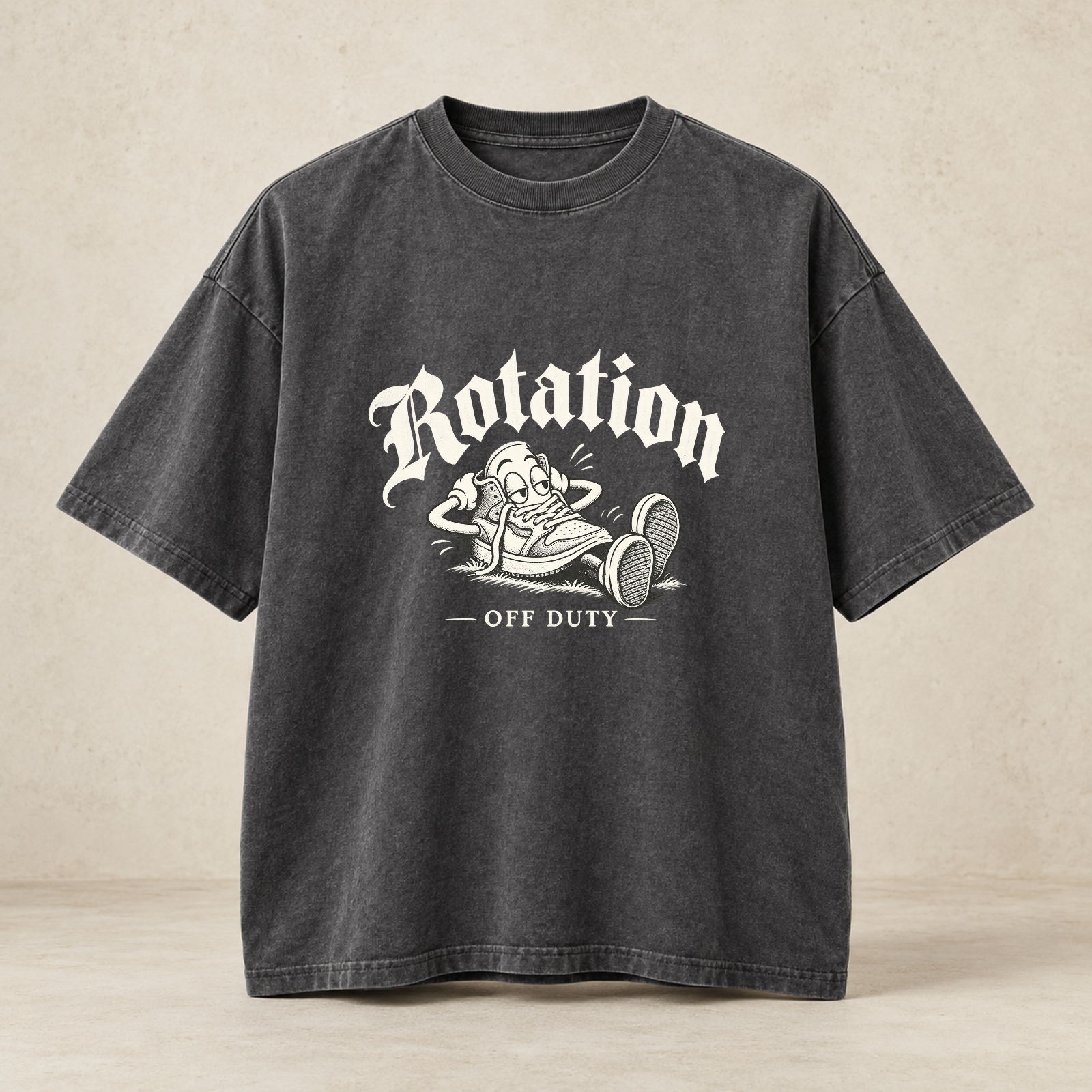
The hard part is not finding a faded black tee. The hard part is finding one with the fabric quality, proportion and original artwork to avoid borrowed nostalgia.
Start with the lie detector, not the label
You find the perfect faded black tee online: the collar looks romantically tired, the graphic is almost legible, and the seller has photographed it under lighting best described as haunted kitchen. The real question is not whether it looks old. It is whether the shirt has a reason to exist beyond borrowed nostalgia. A strong vintage graphic tee should solve a styling problem: it gives a plain outfit a point of view without making you look as if you are wearing someone else’s memory as rented furniture.
That distinction matters because the T-shirt is powerful precisely because it is plain. A Google Arts & Culture history adapted from MoMA traces the white T-shirt from undergarment to mass wardrobe staple, noting how it became a unisex garment used across cultures, styles and identities over roughly the last seventy years. The same history describes its later role as a base for customized branding and personal expression. A tee carries identity quickly. Useful, yes. Also risky. A bad graphic can undo good trousers faster than a weak handshake.
British GQ’s 2026 piece on fake-distressed T-shirts frames the current buying tension neatly: real vintage can be hard to find in the right graphic, size and wear level, while artificially aged shirts split opinion between purists who want earned wear and shoppers who simply want the look now. That is the honest middle ground. A new vintage washed T-shirt is not a lie if it is sold as new and designed well. It becomes embarrassing when it pretends to have opened for a band, joined a motorcycle club and survived three basements before breakfast.
Read the cotton before you read the graphic
The first test is fabric. Not every good tee needs to be heavy, but it does need enough substance to hang properly. Slub cotton gives a broken-in surface because the yarn is uneven; it can make a simple shirt feel less sterile without relying on fake holes. Pigment dyeing and garment washing can bring depth to black, charcoal and ivory, especially when seams catch slightly different tones. A faded black tee should look sun-softened, not chemically bullied.
HUMAN MADE’s Graphic T-Shirt page, accessed 2026-10-08, gives a useful example of what product detail can tell you before you buy. The shirt is listed as 100% cotton, made in Japan, with uneven slub yarn, a rounded seamless body and a double-binder neckline. The page also notes that washing can create slight size and texture differences. You do not need that exact shirt to learn from the description. Look for specifics: cotton type, neckline construction, body shape and wash behavior matter more than a paragraph of misty brand romance.
The collar deserves particular suspicion. A neckline that collapses by lunch makes the whole shirt look accidental. Double-binder construction, sturdy rib or a well-set neckband is worth attention, especially on oversized graphic tees where the body already has volume. If the collar is too wide and the shoulder is too dropped, the shirt slides from relaxed into laundry-day despair. The sweet spot is a neck that frames the face, a shoulder that eases off the body without impersonating a poncho, and sleeves that hit with intention rather than resignation.
Original artwork beats fake autobiography
The best graphic tees have authorship. They do not just place a skull, a flame, a fake date and a distressed rectangle in a blender. They understand reference, spacing and tone. The Met identifies Martin Margiela’s spring/summer 1989 trompe l’oeil tattoo shirt as an early emblematic Margiela design from his first Paris runway show, using a skin-toned net top to blur body and garment. The useful lesson is not that every tee needs to be conceptual. It is that an image on a body can do more than shout.
The V&A’s history of Vivienne Westwood records how the Westwood and Malcolm McLaren Seditionaries period used distressed-looking garments and challenging screen-printed graphics on frayed T-shirts and muslin tops, connecting the graphic tee to punk’s cut, damage, music and provocation. That history is often flattened into a moodboard: rip something, print something angry, call it heritage. The original charge came from context, silhouette and provocation working together.
For today’s buyer, originality can be quieter. A museum-label front hit, a dry-cleaning ticket back print, a fictional roadside-service emblem or restrained gothic lettering can all carry personality if they are drawn and arranged with care. The question is simple: would the graphic still be interesting if you removed the artificial cracking? If the answer is no, the shirt is relying on patina as a personality substitute. We have all met that person at dinner.
Runway relevance is not a shopping command
Graphic tees are not hiding from fashion’s center right now. Brain Dead’s T-shirt category, accessed on 2026-10-08, showed a broad mix with size filters from XS through XXL and unisex/men options, including music, film, artist and collaboration references such as Sound & Fury, Ultraman, Predator, Star Wars, A.P.C. and Andersson Bell. Visible prices on that page ranged from $32 sale or listing items to $95 striped tees. The category can span everyday cotton, collaboration culture and collector-minded design without becoming one thing.
Vogue’s October 6, 2026 roundup of Spring 2027 runway graphic T-shirts pointed to self-aware runway uses, including Moschino’s fitted “Good Luck” shirt and Lacoste’s clay-court-stained tee dress. That supports editorial relevance, not sell-through, trend dominance or urgency. The practical point is that graphic tees work at multiple levels of fashion because they deliver message and proportion quickly.
For styling, avoid treating the tee as the entire outfit unless the shirt is exceptional. A fitted graphic tee works with relaxed pleated trousers and loafers because the contrast feels deliberate. A boxy streetwear graphic tee wants straighter denim, washed cargos or a clean work pant. A long, oversized graphic tee can look good under a cropped jacket, but if the hem floats too far below everything else, you are no longer layering; you are announcing a scheduling conflict.
Style the tee, not the souvenir shop
Music merch styling is the trap and the opportunity. A real tour tee with provenance, good cracking and a graphic you actually care about can be great. A fake tour-style tee with invented dates and borrowed iconography usually looks thin, even when the cotton is thick. If you want the mood without cosplay, build around feeling rather than imitation: faded black tee, washed black overshirt, straight-leg denim, worn sneakers, minimal jewelry. Let the shirt carry one cultural reference, not twelve.
Chrome Hearts and Yeezy can sit on the cultural moodboard here as context: dark palettes, heavy cotton, gothic type and blunt proportion. Copying logos, crosses, layouts or graphic habits is neither homage nor strategy. It is a shortcut with a short shelf life. The useful takeaway is discipline: black and ivory, negative space, confident lettering, and silhouettes that make a tee feel like part of a uniform rather than a novelty purchase.
If you are buying vintage graphic tees with original artwork, judge the composition as you would a poster. Is there a hierarchy between image and type? Does the back print justify its size? Are the margins intentional? Is the typography legible enough to reward a second look, or is it simply distressed into moral ambiguity? A good tee should make sense from ten feet away and get better up close. A bad one does the opposite: big noise at a distance, clip-art confession in person.
A Designer Rotation direction: old soul, new alibi
For GIOVANNI by Benicio Giovanni Zabaleta / Designer Rotation, the strongest lane is not pretending a new tee is vintage. It is building original graphic tees that understand why vintage works: softened color, readable wear, specific humor and a cut that earns repeat use. Washed black and ivory are the right base because they age visually without calling in a costume department. Restrained gothic lettering can work when balanced by Italian editorial spacing and cleaner serif type. The tension is the point: romantic type, dry joke, wearable body.
One relevant Designer Rotation concept in review is Off Duty, product ID DR-F15AA9DC1329. The catalog describes it as a sleepy cartoon sneaker lounging on its day off, with vintage pen-and-ink drawing, ivory screenprint, subtle halftone, restrained old English Rotation above and OFF DUTY below. Important buying note: it is an approved artwork concept with a garment preview; supplier sizing and delivery are still being connected, and it is not yet offered for sale. Treat it as a direction, not a product recommendation.
The concept works because it has a point of view without borrowing a fake archive. A lounging sneaker is funny in a low-key way; the ivory screenprint and halftone can sit naturally on washed black; the typography gives it a fashion register without turning the chest into a door nobody asked to open. If produced, the garment would need the same standards outlined above: a collar that holds, a relaxed but controlled body, and print texture that looks integrated rather than pasted on at the last possible second.
The final checklist
Use a four-part buying test. First, fabric: cotton with texture, enough weight to drape, and a wash that has depth rather than damage cosplay. Second, proportion: relaxed does not mean shapeless; the shoulder, sleeve length and collar should all look chosen. Third, print method: screenprint, puff print, halftone or pigment treatment should serve the image, not distract from weak artwork. Fourth, authorship: the graphic should say something specific, even if the message is deadpan and small.
If you are shopping true vintage, be conservative about claims. Resale availability, pricing, provenance and condition change constantly, and this article does not verify any individual secondhand listing. Ask for measurements, check collar and pit condition, look closely at cracking and staining, and do not pay a premium for a story that is not documented. Historical dates and current availability are different things; a shirt can reference a decade without being from it.
The actionable choice is this: buy the tee with the best idea, not the most aggressive aging. If you want true vintage, prioritize verified condition and a graphic you would still wear if nobody recognized it. If you want new, choose a vintage washed T-shirt that admits it is new and earns its patina through fabric, cut and original artwork. The smartest shirt in the room is rarely the loudest. It is usually the one that looks easy, fits correctly and has a joke or image sharp enough to survive the wash.
Choose graphic tees for fabric, fit, print texture and authorship. Real vintage needs verified condition; new vintage-washed tees should not pretend to be old.
Sources & reporting
This story was prepared with AI-assisted research and reviewed before publication. Opinions are editorial; product details and availability come from our catalog.
The Surprising History of the White T-shirt — Google Arts & Culture ↗Maison Margiela - Shirt - The Metropolitan Museum of Art ↗Vivienne Westwood: punk, new romantic and beyond · V&A ↗HUMAN MADE GRAPHIC T-SHIRT – HUMAN MADE Inc. ↗T-shirt – Brain Dead ↗Here Are the Best Graphic T-Shirts From the Spring 2027 Runways | Vogue ↗Is it lame to fake a distressed T-shirt? | British GQ ↗